THE ARCHIVE · BRAND IDENTITY
The Making of the Mark
Designing meetmrstewart.com
A brand for someone at the intersection of fine art, technology, and towering personal presence can't rely on standard formulas. A Studio Art major turned AI trainer and advocate, Mr. Stewart needed an identity both deeply personal and commanding.
I
The Original Foundation
The work was an exercise in translation — turning physical stature (6′7″), a passion for music, and the logic of technology into a single, high-stature maker's mark.
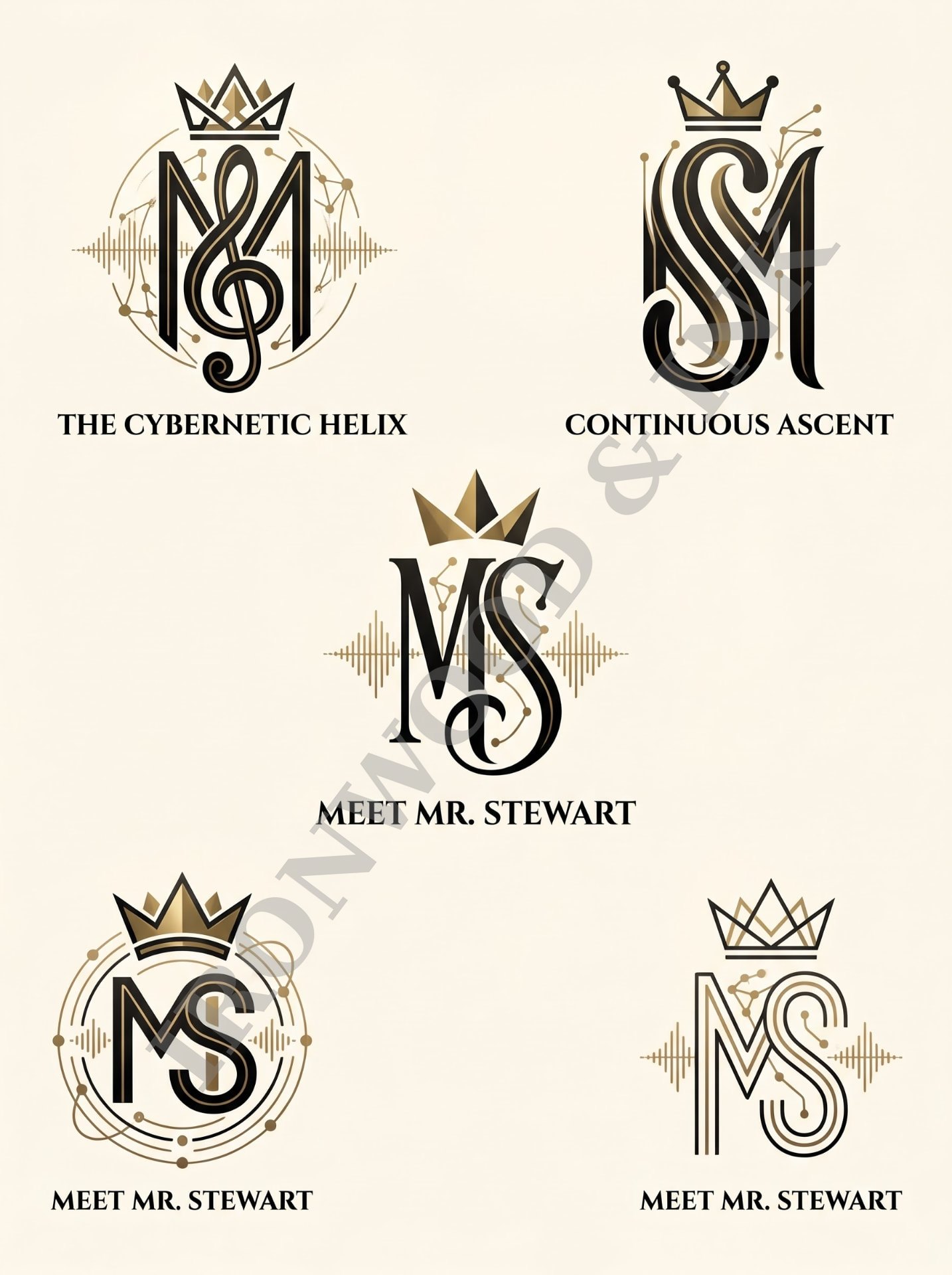
It began with the original branding: an ornate crest built around an interlocking "MS" and an elaborate royal crown. It carried historical weight, but a digital brand needs to be agile and future-facing. The first step was stripping away the vintage detail to isolate the true centerpiece — the relationship between the M and the S.
II
Embedding the Invisible Narrative
Rather than literal illustration — circuit brains, musical notes — the story was woven into the geometry itself.
- The Verticality of Stature
The monogram was drawn with a soaring, architectural verticality. Its elongated, upright form anchors the whole system and signals leadership.
- The Pulse of Technology
Micro-fine network lines and nodes run through the inner contours of the letters, a quiet nod to AI education, training, and advocacy.
- The Wave of Music
A fine, pulse-like wave crosses the vertical forms — at once a digital wavelength and the visual cadence of music.
III
Refining the Crown
A strong brand is defined by what it takes away. The heavily shaded crown of the original was reduced to a low-profile, five-point geometric crown — an understated cap that lets the interwoven "MS" hold the eye without competition.
IV
The Artist's Signature
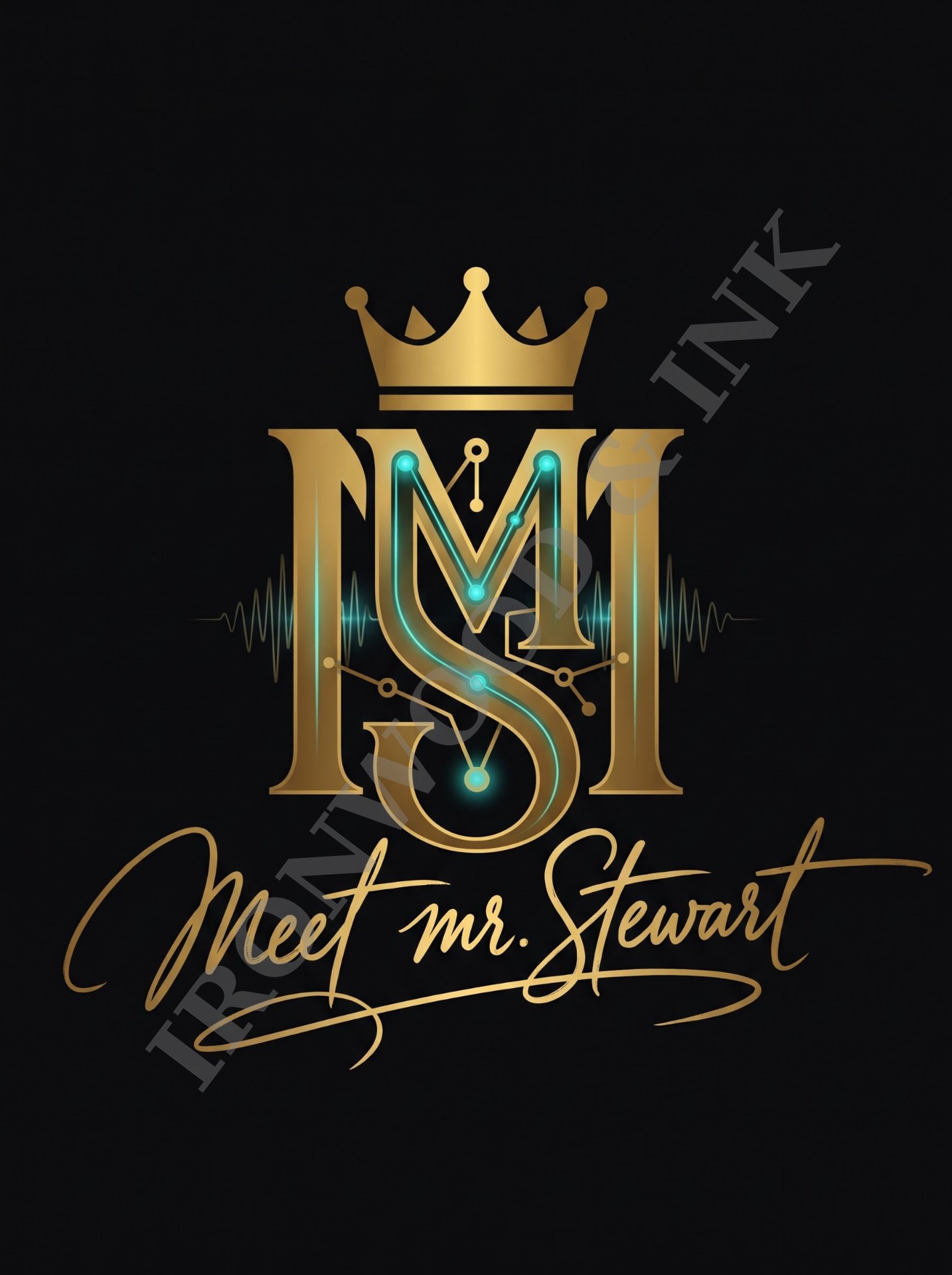
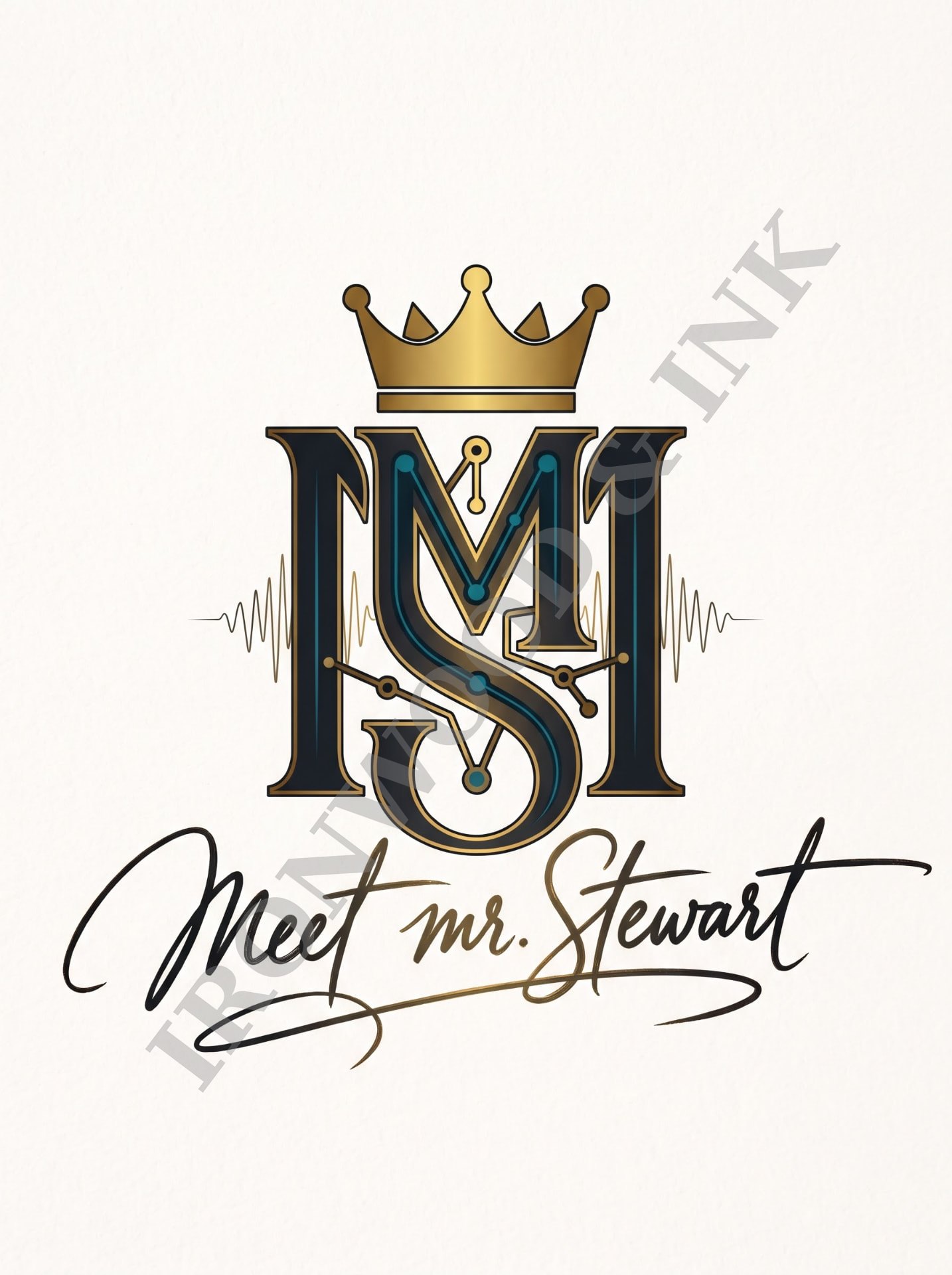
Mr. Stewart's background in studio art inspired the final breakthrough. To keep a geometric monogram from feeling cold, the identity gained a human counterweight: a flowing "meet mr. stewart" script with the gesture of a fountain pen.
Above, the monogram is structured and digital; below, the signature is sweeping and human — an artist's sign-off bridging creativity and logic.
V
A High-Contrast System
- Cinematic Obsidian — Dark
Burnished gold on obsidian black, lit by a glowing cybernetic teal for the pulse of AI and the vibration of sound.
- Matte Parchment — Light
Deep midnight-charcoal with dark-bronze outlines and jewel-teal accents, keeping its depth and paper-like weight on light backgrounds.
VI
The Result
A mark designed not just to identify, but to have presence — balancing the structure of technology with the expressive rhythm of a creator.