THE ARCHIVE · POLITICAL CAMPAIGNS
America Together
A concept identity for the 2028 presidential cycle
Modern politics pulls between digital polarization and a hunger for stability. The brief was not a single campaign logo but a maker's mark for civic duty: a decentralized system meant to unite rather than divide, with a center the electorate helps fill.
I
The Foundation
Presidential identities have long leaned on the same toolkit: screaming eagles, military chevrons, and saturated corporate red, white, and blue. They project institutional authority at a moment when many voters distrust institutions.
The strategy stripped away that high-gloss patriotism — the aggressive all-caps type and vibrating screen colors — and rebuilt around grounded authenticity. The starting point was not the Oval Office but local communities, historical archives, and the American landscape.
II
Embedding the Invisible Narrative
- The Geometry of the Collective
In place of sharp, forward-leaning angles, the mark is built on an unbroken circle — democracy as a constant, protective loop rather than a race to a finish line.
- The Architecture of Labor
A modern slab serif stands in for infrastructure and work. Its squared terminals avoid both delicate elitism and cold tech minimalism, signaling a willingness to do the heavy lifting.
- The Axis of Decentralization
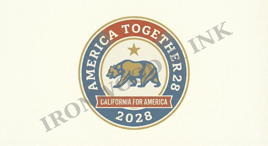
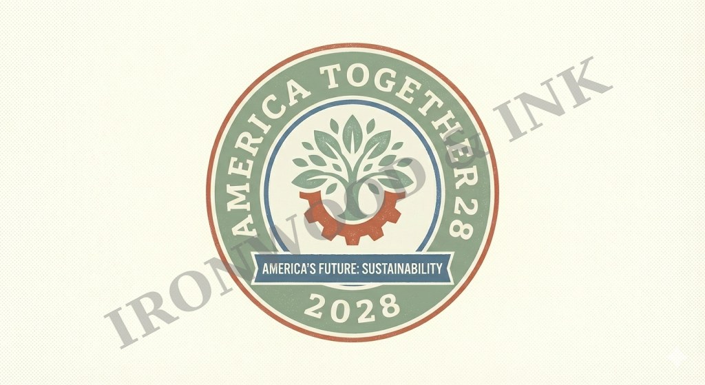
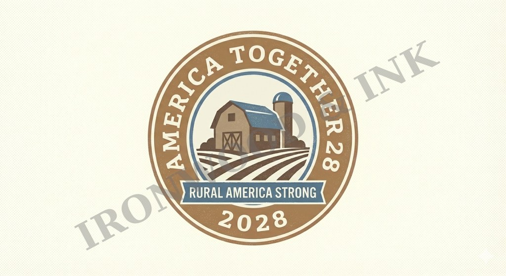
The center of the badge is a modular container. The negative space is an invitation: the heart of the campaign is the community that fills it, not the candidate.
III
The Sovereign Accent
When the center holds the national brand, it carries an interlocking "A" and "T" monogram — no stars, no stripes, no gradients. The letters share structural stems to form a single pillar, holding the hierarchy through simplicity alone.
IV
The Contrast
Pure geometry can feel cold. To counter the precise circles and heavy slab serifs, the vector lines carry a subtle distressed texture in the spirit of a letterpress or risograph print — warmth against structure, so the mark feels at home in a local field office rather than a central committee.
V
A Responsive, High-Contrast Palette
Moving away from eye-straining screen vibrance, the palette is built on calm, organic extremes.
- Parchment Cream · #F4F1EAThe canvas — archival, calm, and easy on the eye.
- Faded Slate Denim · #4A6B82The depth — the stability of a night sky without militaristic navy.
- Terracotta Rust · #B85B49The accent — the warmth of clay and brick in place of siren red.
VI
The Result
America Together works less like a single logo and more like a system. The same frame scales from a broadcast graphic to a yard sign, while the center changes to speak to each community — California, sustainability, rural America. The most lasting marks don't shout the loudest; they leave room for people to belong.