THE ARCHIVE · POLITICAL CAMPAIGNS
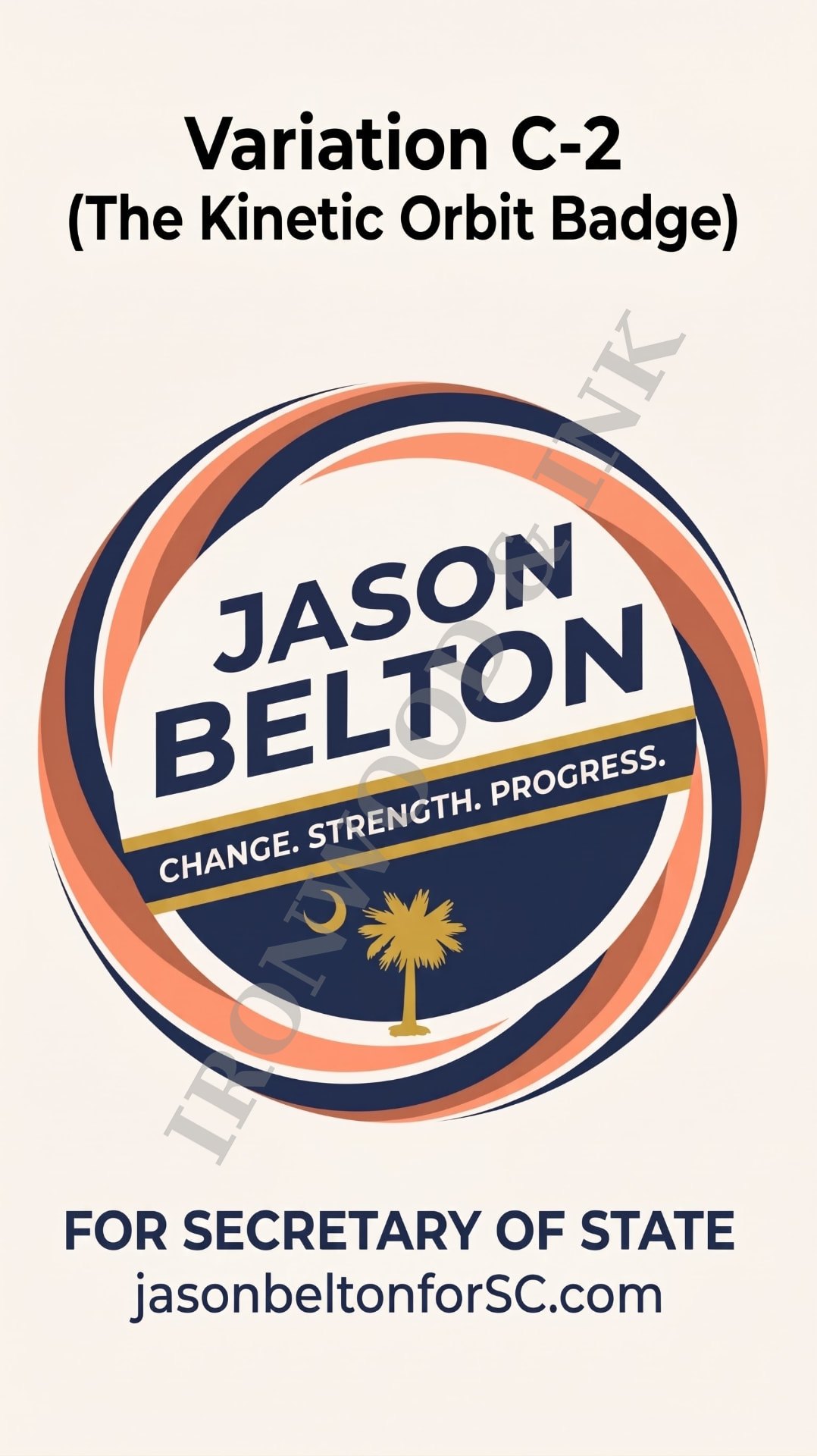
The Kinetic Orbit Badge
Jason Belton for South Carolina Secretary of State
A statewide campaign identity is a vessel for public trust. Jason Belton — labor organizer, entrepreneur, and candidate for Secretary of State — needed a mark that signaled momentum, integrity, and authority, and held up equally on a lawn and on a phone.
I
The Original Foundation
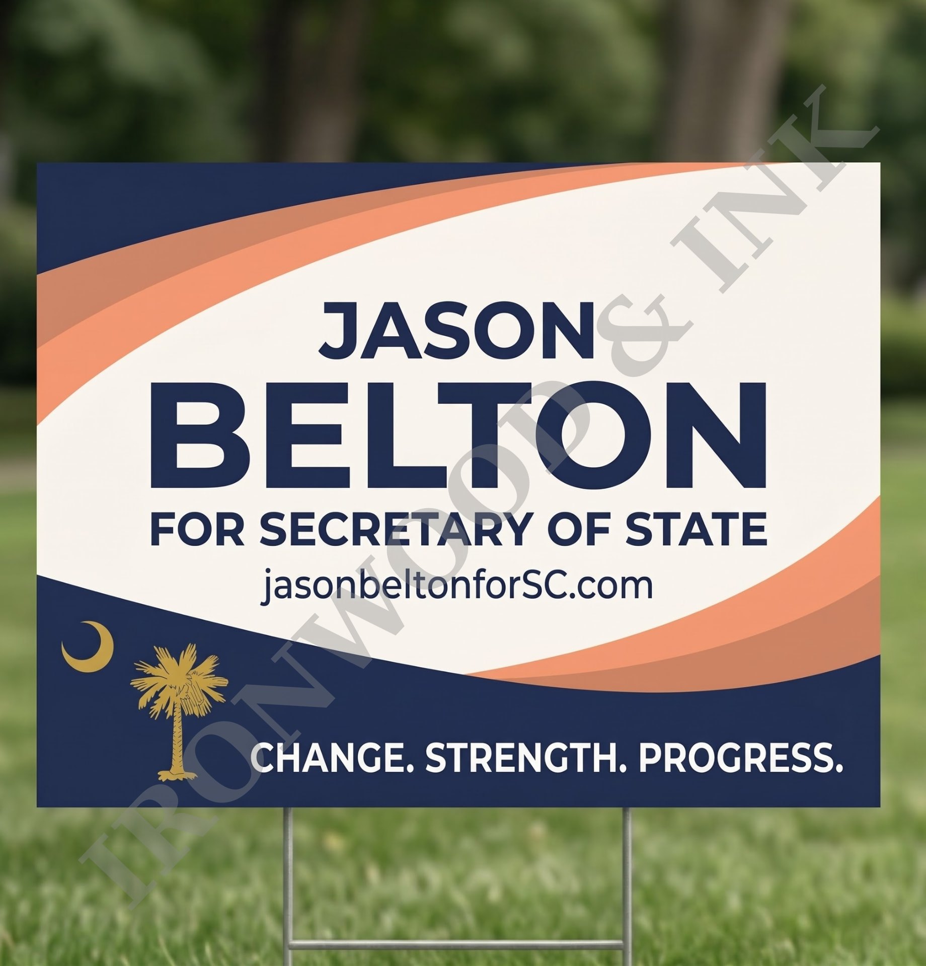
The campaign's first visual footprint was its yard sign: bold type framed by sweeping, intersecting waves. It had a forward-leaning energy, but its geometry was horizontal and tied to a rectangle.
To carry the brand across every channel, that energy had to be distilled into a centered, scalable crest — simpler geometry, same momentum.
II
Embedding the Candidate's Story
Belton's background pairs precise orchestration — managing state operations for the AFL-CIO — with human resonance as a classical opera and gospel vocalist. The design translates that duality into its structure.
Concentric orbiting paths echo the precision of modern, well-run elections. The palmetto and crescent sit within the orbit, grounding a statewide platform of accessibility and transparency in South Carolina heritage.
III
Simplifying the Seal
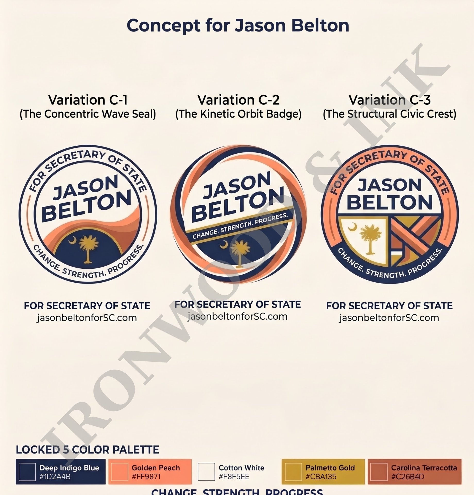
Early explorations leaned on civic shields and rigid geometric blocking. They carried weight but felt heavy. Removing the borders and the traditional seal framing let the waves orbit freely, and the open space draws the eye straight to the name and the emblem.
IV
Typography as the Human Voice
The central stack uses the geometric authority of Montserrat. "BELTON" commands the primary scale, with "JASON" set flush above it in proportion. The tagline — "Change. Strength. Progress." — runs as a structural crossbar, giving cadence and warmth to the institutional weight of the name.
V
A High-Contrast Palette
Built for legibility from a broadcast monitor to a dim street corner.
- Deep Indigo Blue · #1D2A4BThe anchor — lets the name project forward.
- Cotton White · #F8F5EEA warm parchment alternative to stark white.
- Golden Peach · #FF9871High-visibility tracer for the orbiting bands.
- Carolina Terracotta · #C26B4DDepth and warmth in the waves.
- Palmetto Gold · #CBA135Reserved for the state emblem and tagline rule.
VI
The Result
The Kinetic Orbit Badge turns a complex operational and cultural background into a single, legible seal — disciplined type and orbiting waves in one scalable, authoritative identity for the 2026 campaign.